Originally published in The Official Ionic Blog.
We have been using Ionic at Savelist since the first alpha versions, and always thought that one of its strongest benefits is the ability to code an app for iOS, Android and the Web with a single codebase. Heck, we even use Ionic to build our browser extensions!
When we went through the process of launching the Savelist Progressive Web App in January (2017), we noticed that even though it looked as expected on mobile – as we started with a “mobile first” approach – it didn’t look quite right on the larger displays of laptops and desktops. Navigation bars and content were too wide and since most content was aligned to the left, there was too much white space on the right of almost all our screens. It felt more like the maximized version of our Android app than a website.
In the process of customizing Savelist for larger screens, we collected some tips & tricks that we wanted to share that could help you adapt your app for the desktop, without compromising the mobile experience we already had.
This guide is based on the latest release of ionic-angular at the time (3.9.2). If you’re using an older version of Ionic, I strongly recommend you to update to the latest release.
Setting up the fixed grid
Ionic has a great grid system based on flexbox that we can use to adapt content and make it responsive. It’s incredibly customizable, and we can define custom grid widths and breakpoints for every resolution.
First, we limited the grid width in order to make the content easier to navigate. For our needs, all we had to do was removed the xl breakpoint. Ionic handles this without any issues.
In our src/theme/variables.scss:
$grid-breakpoints: (
 xs: 0, // Phone (0px - 575px)
 sm: 576px, // Phablet (576px - 767px)
 md: 768px, // Tablet vertical (768px - 991px)
 lg: 992px // Tablet horizontal, Desktop (992px and above)
);
Next we modified the $grid-max-widths variable and made our app use 100% of the width until it reaches 992px:
$grid-max-widths: (
 lg: 992px
);
You could use any other size you’d want for this, as long as the value lgfrom $grid-breakpoints matches.
Using the fixed grid on pages
In order to apply a max-width to our pages, we just wrap the markup inside <ion-content> with <ion-grid fixed>. The fixed attribute tells Ionic’s grid to use the max-width corresponding to the current breakpoint, or 100% if not defined.
So this code:
<ion-content>
 <!-- Some code -->
</ion-content>
Becomes:
<ion-content>
 <ion-grid fixed>
   <!-- Some code -->
 </ion-grid>
</ion-content>
We don’t need to apply this to pages that are displayed inside modals or popovers, as they already have a fixed width.
Horizontally center the header & footer toolbars
We have better looking pages now, but the toolbars inside <ion-header> and <ion-footer> are not horizontally aligned. We can easily adjust them to match of our fixed-width pages by adding these rules at the end of app.scss:
// Desktop

ion-header .toolbar {
 margin: auto;
}

@media (min-width: map-get($grid-breakpoints, lg)) {
 ion-navbar.toolbar,
 ion-header .toolbar[fixed],
 ion-footer .toolbar[fixed],
 ion-tabs .tabbar {
   margin: 0;
   padding-right: calc((100% - #{map-get($grid-max-widths, lg)}) / 2);
   padding-left: calc((100% - #{map-get($grid-max-widths, lg)}) / 2);
 }
}
If there is any <ion-toolbar> inside <ion-header> or <ion-footer>, you may want to add the fixed attribute to center them, like <ion-toolbar fixed>.
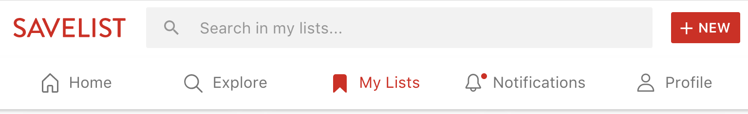
Showing tabs at the top
While users are used to having tabs at the bottom in mobile apps, desktop webs usually show them at the top for better usability and navigation. Well known apps like Twitter, Pinterest and Instagram all use tabs at the top for their desktop experience.
Fortunately, Ionic Framework allows us to easily customize the position and layout of the tabs, so we can have bottom tabs with icons on top in our mobile experience:
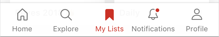
And top tabs with icons on the left for our desktop experience:
To achieve this we can bind class properties to the tabsPlacement and tabsLayout attributes of our <ion-tabs>:
<ion-tabs [tabsPlacement]="tabsPlacement" [tabsLayout]="tabsLayout">
    <!-- Tabs here -->
<ion-tabs>
And set the values depending on the platform:
@Component({
  templateUrl: 'app.html'
})
export class AppComponent {
  tabsPlacement: string = 'bottom';
  tabsLayout: string = 'icon-top';

  constructor(
    public platform: Platform,
  ) {
    if (!this.platform.is('mobile')) {
      this.tabsPlacement = 'top';
      this.tabsLayout = 'icon-left';
    }
  }
}
You can check the different placement and layout options in the Tabs docs.
Using the responsive grid and breakpoints
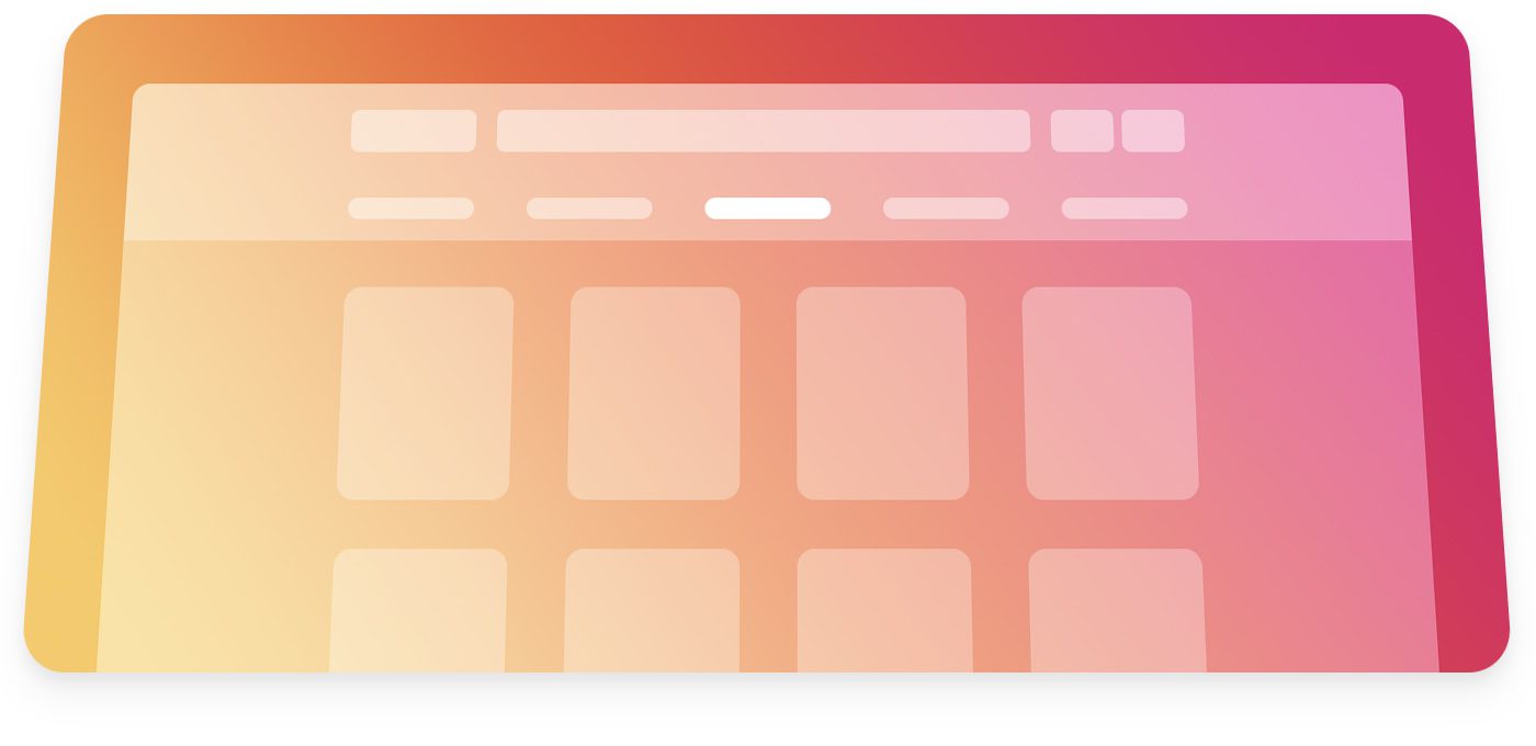
One of Savelist’s key features is the ability to show all the products you have saved from the web in a clear and organized layout, so cards in a responsive grid was the best way to go in displaying that information.
This option lets you have one or two cards per row on mobile, and more cards as the screen gets bigger. Cards don’t have a fixed width and make the best use of the available space.
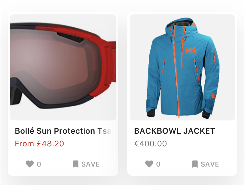
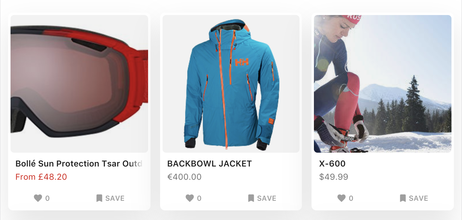
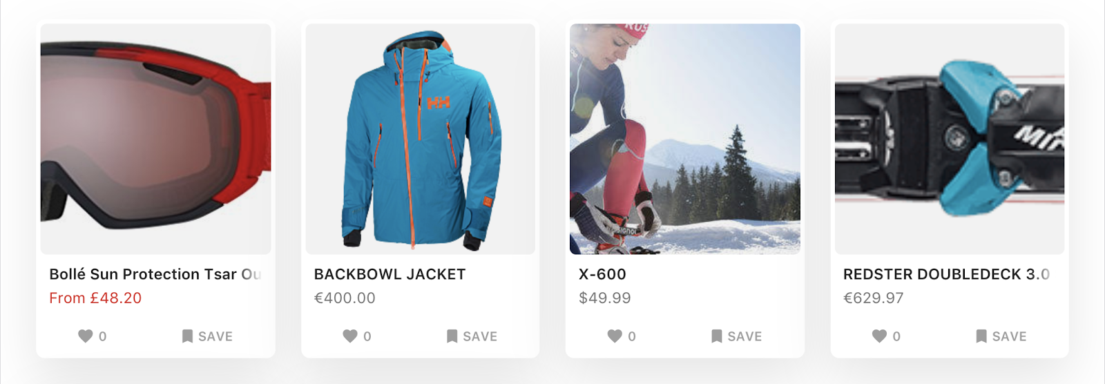
It’s easy to achieve this layout with the help of the grid breakpoints we set up before and col-{breakpoint}-{#}:
<ion-grid fixed>
 <ion-row>
   <ion-card ion-col *ngFor="let product of products" col-6 col-md-4 col-lg-3></ion-card>
 </ion-row>
</ion-grid>
Rows will start with 2 cards on xs and sm, 3 cards on md and 4 cards on lg and above.
Adapting the experience
We have addressed the biggest points of adapting the PWA “app shell” to big screens. However, you may still notice some items that you want to show differently, like font size, images, UI, etc.
There is no silver bullet for this, but you can achieve almost anything you want starting with this media query, so if you ever change the lg breakpoint the media query will update as well:
@media (min-width: map-get($grid-breakpoints, lg)) {
 // Your rules here
}
Another way is to show or hide elements according to the platform type instead of the screen size with showWhen and hideWhen. You can use the value core to target desktops.
Share your tricks!
This was just a few of the changes we made to Savelist in order to look better on larger screens, but I’m sure there’s more ideas out there. I’d love to know what tricks you have in your bag with working with Ionic, so leave a comment below!